CSU Prospectus 2004
WORK PORTFOLIO
Design for Camden Summer University prospectus 2004
 (front cover)
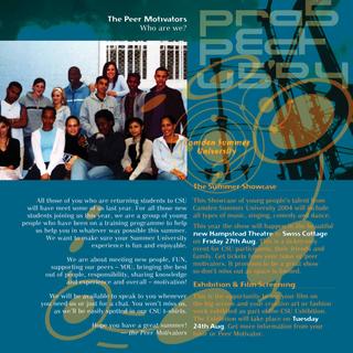 (inside front cover)
 (back cover)
Watch out for my posting on the previous CSU Prospectus 2003. See if you can spot the crop circles there too! Was that a prank or an alien meddling in the fields perhaps this could be a topic of discussion down at the pub.
The background photos were old photos of mine of an old steel structure in Camden and a Covent Garden alley on a summer evening when the sun was low. The orange and blue colours remind me of the long summer days when you could drink PIMMs all evening.
The inside front cover had to highlight the CSU Showcase and Exhibition which happens at the end of the summer. It also had some information on the Peer Motivators who help out throughout the Summer University.
Footnote: One of the restrictions was I had to use a few non-dynamic low-res and badly-masked photos someone else had taken of a few young people posing in a photography workshop ... it was a PC exercise rather than the right visual content. Sometimes you have to work with that so you do the best you can. I somehow incorporated them into the circles, in the back cover.
Other links you might be interested in:
CSU Prospectus 2002
CSU Prospectus 2003 (to come)
 (front cover)
 (inside front cover)
 (back cover)
This was a difficult cover to do as I had to juggle with the newly-introduced corporate guidelines. The cover was approved prior to that so they did not have budget to change but it had to be done otherwise it was to be a desperately white background with a masked-out figure and green logo - this was the corporate style.
Part of the idea behind this is about satellite, networking. My client contact and I happened to like sci-fi so I decided to put something about the summer solstice and crop circle designs.
Watch out for my posting on the previous CSU Prospectus 2003. See if you can spot the crop circles there too! Was that a prank or an alien meddling in the fields perhaps this could be a topic of discussion down at the pub.
The background photos were old photos of mine of an old steel structure in Camden and a Covent Garden alley on a summer evening when the sun was low. The orange and blue colours remind me of the long summer days when you could drink PIMMs all evening.
The inside front cover had to highlight the CSU Showcase and Exhibition which happens at the end of the summer. It also had some information on the Peer Motivators who help out throughout the Summer University.
Footnote: One of the restrictions was I had to use a few non-dynamic low-res and badly-masked photos someone else had taken of a few young people posing in a photography workshop ... it was a PC exercise rather than the right visual content. Sometimes you have to work with that so you do the best you can. I somehow incorporated them into the circles, in the back cover.
Other links you might be interested in:
CSU Prospectus 2002
CSU Prospectus 2003 (to come)
posted by PipoPep @ 10:48 pm
0 comments
![]()

0 Comments:
Post a Comment
<< Home