Health & Leisure Guidebook
Client: Poplar Harca (PH)
Status: Mockup Proposal
Languages: Tri-lingual/20 sections
The brief was to produce a guidebook or summarised directory for the Tower Hamlets residents on the health and leisure activities in their area. Such as canal walks, the gym for young people, women only walks, indoor sports, local health practitioners, healthy eating sessions.
I wanted to give a feel of fleetiness and youthfulness and a goodfeel factor. I drew these delicate illustrations with the intention to inject it with a sense of humour. Three colour codes on tabs on the right side to denote different language: English, Sveleti and Soomali.

Cover:
I drew the children somersaulting on front cover, creating movement and dynamism and motivation to have fun and enjoy healthy lifestyle ... The star-shaped somersaults resonating the stars in the Tower Hamlets Partnership logo.

Intro spread: Inside front cover vs. Contents page
It continues on the inside front page, with a couple more somersault kids in light grey colour. It gives a brief description of the guidebook and a website address. Opposite that page is the Contents page.
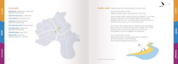
A sample next spread: Local Parks location vs. Healthy Walks page
Local green parks are pointed out in a location legend within the borough grey map. Opposite page shows the local heron feeding and flying off, one of the sights when I go walking along the canal, where it is still teeming with wildlife.
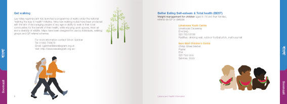
Next sample: Get Walking page vs. Better Eating weight management for children page.
The reader is subtly reminded of the Poplar Harca logo (three poplar trees with grey shadows) in another section where the walkers using Nordic poles, a hint of fir tree in the background.
Outline silhouttes of 3 coloured friends eating their watermelon ravenously, reflecting the multi-culturalism of the area. More importantly watermelon reminded me of the hot summer days.
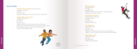
Next sample: Sports facilities double spread.
Boy and girl chasing the shadow of a football. Sports should not discriminate between sex or age. A mountain climber scaling the edge of page.
The English section is marked by a full page bleed of orange, its assigned colour code. The language die-cut tabs follow throughout each section. Sveleti in blue and Soomali in purple.
Printer details:
The client specified comb binding on left edge. We're recommending the use of a particular bright recycled paper stock.
This was my first design project for the design studio.
Update:
Client liked it so much they ordered a 2nd print run.
posted by PipoPep @ 9:45 pm
0 comments
![]()

0 Comments:
Post a Comment
<< Home